
Letter from Qatar: Qatar is slowly moving to the winds of change


 The earlier that this can happen on the journey to a new beginning, the better.

Brand strategy and communications sometimes seem like an "add-on". After all how many marketing/communication directors make it to the Board? And how many are CEO's? Furthermore, the political/economic/social environment one finds oneself in often dictate what one can or cannot achieve by way of brand/communications strategy.
In less developed countries, the power of brand is HUGE as individuals encircle themselves with the trappings of power and success to validate/justify their success and show the world they made it!. This is less true in more developed countries, as people become more disillusioned by the shackles of capitalism and long for a return to a more simple, authentic life. Hence the move towards "no brand", "no frills", "slow food" and more focus on life/work/play balance. This is important. Because people are changing their view of what's important in their lives. Companies and their brands that don't recognise this new paradigm are going to be overtaken with more enlightened brands that get it!
The CEO of restaurant chain Wagamama tells us: "The main thing is to keep the main thing the main thing."

He should know. He has built Wagamama into a global empire. Today the company has 86 restaurants in 11 countries, and is worth US$1bn.

The essence of brand is about what you value. Values represent the key differentiator and rallying cry for effective positioning in a crowded market place. Not only does this value (or set of values) inspire your workforce, it also resonates with people’s desire for self-expression, validation and justification. “This is who I am, or who I want to be” – your brand or product is part of a multi-layered shorthand for people to express their personality, attributes, sense of place and belonging. The greatest gift that commerce has ever given culture and the fundamental DNA, or essence, is the brand; stripped of all permutations and adornments and representing a story, a brand story that is believable, campaignable and above all compelling in its authenticity.
The individual seeks identity and a sense of belonging; hence families, tribes, nations and regions instill an enormous sense of pride and self-belief. Just watch the winning football team’s fans as they leave the stadium or when their player scores that winning goal.
The Olympics, now the rallying cry for many nations’ athletes remains an exemplary opportunity for companies to link their values with those of the premier sporting events this planet produces.
On a more realistic note, routes to market, price, distribution, quality control and all the elements that form the engine of a company’s offer, pale into insignificance if they don’t stand for something which resonates with people, naturally. The brand represents your real route to market, everything else is process. Mass production has succeeded. We are over-serviced with 120,000 product lines on the shelves in our supermarkets when 30 years ago there were only 30,000.
Rising to the new consciousness
Fast forward to 2010. We’re looking at a world moving faster at every turn. The convergence of technologies, internet as the great leveller, fragmentation of media, podcasts, social networking - where an amateur songwriter can hold a rock concert from her living room and over 200,000 people tune in - where anyone can be an instant star for 15 minutes and where you are “always on”, everywhere, the traditional rules of ‘pile ‘em high and sell it cheap’ are not valid anymore. There is a new consciousness and awareness permeating the nether regions of society.
The effects of climate change, increasing middle classes, clamouring for more – more meat, oil and steel, more luxury products, more consumption - from India to China and from the Middle East to Russia, we are at the precipice of a quantum leap in consciousness and behaviour. The planet can’t go on like this and the combination of more is less and less is more will meet at noon at the OK corral of life for a showdown for the future of mankind as we know it.
These emerging nations that happen to be centres of some of the largest population groupings in the world are striving harder and working longer to achieve the sense of ‘satisfaction’ and ‘success’ that the promise of mass consumerism can offer.
The extent of their longing is now limited only by the day of reckoning, when the planet, sick of all this abuse of resources and environment, reacts violently and decimates a large swathe of our population, or forces us to re-adjust radically as we face the heating up of our environment, to the point where the very basics of food, water and clean air become scarce.
The death knell is sounding and many companies are rallying behind the flag that saving the environment is more productive (and profitable) than abusing it.
The West looks East – Middle East!
I don’t profess to be an expert, but it occurs to me that the preponderance of sun in this region lends massively to the notion that the Middle East could become the centre of solar energy production.
We are moving forward with education as one of the key pillars of diversification away from an oil economy. It is important that entrepreneurship linked to the well-being of our planet should provide a rallying cry for the development of complete industries from business incubators, knowledge parks, greenhouses, hydroponic agriculture and water production – in effect safeguarding the future for our children and theirs and fostering the entrepreneurs and scientists that this region has lost as the pendulum of history swung West and East.
‘Back to basics’ is a philosophy based on simplicity, a value that is rare in this over-complicated world as brand after brand seeks to take centre stage by adding more bells and whistles. But don’t mistake naivety for simplicity. There are many brands in Qatar and throughout the GCC verging on the naïve. Why, pray, would you not learn from the basic error that a price-led philosophy loses out over a value-led philosophy not often, but always.
Why do tenders invariably go to the cheapest bidder and not to the one who offers the most value? The Chinese are very clever at this – they insist on knowledge and information transfer, effectively providing the breeding ground for an employment strategy based on a skills-based economy.
Why do local organisations enact this strange dance of change-step programme: wait, hold, go, quick-quick, slow? Why do companies not invest in people? Instead relying on constant cheap sources of labour against the experience of tried and trusted employees whose knowledge go with them when their NOC is refused and they head home.
To pitch or not to pitch
I am really not one for criticism, nor do I have the solutions, at least not all of them, but sometimes a little common sense goes a long way. In my business of branding, design and advertising, it is clear to me that the constant round of free pitches doesn’t do anyone any good. It only adds to the cost of doing business and doesn’t allow us to build strong relationships and yes, partnerships, with clients to build effective brands and communication programmes. Note that some of the world’s most famous campaigns and strongest brands were built on a long-term relationship between client and agency. Going out to pitch every single time is not only a waste of time and resources for all concerned but is not expedient, nor does it deliver the best campaign as the agency will not have discovered the DNA, the soul, the essence or brand story that should permeate every communication, both internal and external. And so a brand is not built; rather a temporary flag-waving exercise is undertaken that may be pretty and may do the job, but only that job. And the client can prove that they have not wasted the company’s money – well, sort of.
Organic branding. Back to basics – the new way to grow
‘Back to basics’ is the key to build sustainable, powerful brands based on your values. And if you value what we value, then we can build you a powerful brand based on trust, authenticity, partnership and a lot of creativity. Creativity is like grass growing; effectively perceived as effortless in the right surroundings, i.e. fresh air, lots of sun, water and good earth, but there’s a lot of work going on under the surface. An agency is a living organism of people, and hey, so is your company! We all want to be safe, to belong. We all want to work hard, contribute and succeed (well, some do!). And what better way to build a powerful partnership to champion the growth and sustainability of a powerful brand? Simple really. ‘Back to basics’. A formula for growth and development of global brands. And who knows? We might work on something that is actually good for the planet, from reduction of packaging, to streamlining work processes, to energy-efficiency, to instilling worthy values into our community and the list goes on and on.
A strong brand galvanises your workforce. It informs your clients, partners and suppliers. It reduces your customer acquisition costs, thereby increasing your profits and your market share, allowing you to extend the brand into new areas and new territories. It’s business and it’s basic. So seek partnerships not suppliers, seek collaborators who reflect and can communicate your values, who see the bigger picture and not just a short-term fix.
Like an orchestra coming together to create an opera, your agency and you can build a brand that is powerful and valuable.
You hum it, we’ll play it.
Light flows through our eyes and triggers hormone production, which influences our entire complex biochemical system. This biochemical system then affects our being.

yellow = caution
green = safety
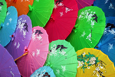
In different countries, certain colours have meanings which may differ in other countries,
e.g. red in China signifies joy, but in Europe it is used to signify danger or anger.
Yellow is sacred to the Chinese but signifies sadness in Greece and jealousy in France.
White, the fusion of all colours, signifies purity (e.g. wedding dress) in Europe but death in Chinese and South American culture.
Leading marketing psychologists have understood the power of colour and the impression that colour makes. The brain is hot-wired to recognise colour and image first, before shape or wording. According to the Institute of Colour Research, human beings make subconscious judgements about any new situation or item within 90 seconds of their initial viewing. Between 62% and 90% of that assessment is based on colour alone. Such is the power of colour.
Red is the colour of blood. Blood equals life. Red is also the colour of passion and anger ( “seeing red” ), so red is associated with aliveness, vitality and strength. It’s a “primary” colour, a colour that is a PURE elementary colour. It’s engaging and emotive. It tends to excite people (“painting the town red”) and triggers the pituitary and adrenal glands, releasing adrenaline. It’s a great colour for restaurants as it stimulates appetite. It has high visibility. Red brings text and images to the foreground. Use it as an accent colour to stimulate people to make quick decisions; it’s a perfect colour for 'Buy Now' or 'Click Here' buttons on Internet banners and websites. In advertising, red is often used to evoke erotic feelings (red lips, red nails, red-light districts, 'Lady in Red', etc). Red is widely used to indicate danger (high voltage signs, traffic lights). This colour is also commonly associated with energy, so you can use it when promoting energy drinks, games, cars, items related to sports and high physical activity.

Orange (a fusion of yellow and red) denotes vibrancy, energy, fun, enthusiasm and exuberance. It’s no surprise then that Orange Telecom chose the colour and the name to appeal to a broad section of the general public. Orange can bring joy to our workday and even stimulate our appetite (for life and learning). Orange is the best emotional stimulant. It connects us to our senses and helps to remove inhibitions and makes us independent and social. Orange increases oxygen supply to the brain, produces an invigorating effect, and stimulates mental activity. It is highly accepted among young people. Orange would be good for a dance studio, a vitamin shop or food products to appeal to an audience seeking energy, warmth and even excitement.
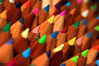
Yellow represents the sun, springtime and brightness. It is the first colour the eye processes.
It is the most visible, which is why it gets the attention faster. Other key words associated with yellow include illumination, clarity, wisdom and self-esteem. Yellow gives us clarity of thought, increases awareness, and stimulates interest and curiosity (great for classrooms). Yellow energy is related to the ability to perceive and understand. The yellow energy connects us to our mental self, signifying communication, enlightenment and spirituality. Yellow is often associated with food. Bright, pure yellow is an attention getter, which is the reason taxis are painted this colour. Use it sparingly as too much use can be counter-productive. Tests have shown that people lose their temper and babies cry more in yellow rooms. Yellow is good for florists, schools, toy shops and sweet shops.
Personality Traits: Good-humoured, optimistic, confident, practical, and intellectual.
Companies using yellow in their logos include: The AA, Ferrari, Yellow Pages, Big Yellow, Caterpillar.

Companies that use green in their logo include: Lloyds TSB Bank, Starbucks, BP, grow, Prozac

Companies that use blue in their logo include IBM, Dell, Deutsche Bank and Pepsi.
Personality Traits: Loyal, tactful, incisive inspiring, inventive, cautious.
Purple combines the stability of blue and the energy of red. For some reason children love the colour purple (no, not the movie). According to surveys, almost 75 percent of pre-adolescent children prefer purple to all other colours. More individualistic, these colours convey imagination, intuition, wisdom and truth. Whether a blue tinge (mystery) or a reddish shade (sensual), these colours are great for elaborate and distinctive establishments including nightclubs, photographers, jewellers and restaurants.
Indigo personality traits: Intuitive, fearless, practical, idealistic, wise, and a truth seeker.

Violet is artistic and creative, sophisticated, luxurious and dignified. Through the blue tinge it is linked with royalty and therefore is great for luxury branding. It’s unusual and at the same time lavish and complex.
Black is a not a colour; it is the absence of colour. While it is associated with death (black plague, witches and evil), fear and the unknown (black holes) and negative connotations (black humour), it also suggests seriousness, boldness, power and formality (black tie).
It’s been used to communicate coolness, modernity, elegance and style. The fashion industry has adopted black wholesale as the experts say that it makes us look thinner, while designers wear black so as not to intrude with the colours they are demonstrating. What is for sure, is that no self-respecting lady would be without a little black “number”.

Each form of the seven colours of the rainbow: Red, Orange, Yellow, Green, Blue, Indigo, and Violet is connected to various areas of our body and will affect us differently emotionally, physically, and mentally. Each colour vibrates at its own individual frequency. In Colour Therapy, therapists believe colours contain energy vibrations with healing properties and that each colour corresponds to one of the seven chakras (energy centres in the body), which in turn can influence a specific gland, organ, or tissue of the body. Healers and therapists use colour to assist in healing and well-being.
So there is more to a colour than liking it or not. In design, practitioners spend years understanding the meaning and power of colour and how they relate to each other and how to use them together, from understanding that dark tones make objects look smaller while light tones do the reverse. Dark colours also lower stress and increase feelings of calm while bright colours spark energy and creativity and may increase nervousness and aggression.
Warm colours (red, orange and yellow) stimulate activity and excitement while cool colours (green blue violet) are more soothing and relaxing.
It’s important therefore to trust your designer with the use of colour, its degree of saturation (how much grey is there) and luminosity (how much white or intensity is there) and the hues (warm or cool) or depth (light or dark). Their experience is objective, based on a deep understanding of the power of colour and their uses and not based on the subjective “I like yellow!”. Colour should not be used simply for differentiation from competitors. You need to choose a colour that fits your brand message. Trust a designer who understands the theory of brands and the psychology of colour. It’s a science as well as an art.


Our final day. it’s sunny today. We drive off towards Tetbury and near the outskirts, we visit an Arboretum Park replete with observation centre, and massive amount of trees from all over the world. We walk a little bit around these beautiful trees and park,and then find a bench to sit on – we ruminate on all the houses we have seen as Alistair probes us for our feedback and two cameras point relentlessly at us.
It’s interesting to look back at the various houses and see how they showed us first a character house in the cotswolds and then a house with huge space and then character with space and then something completely different. Much food for thought. I know Nidhi like the Tetbury house and the split between guest house and art gallery.
I fell in love with the farm and saw myself as gentleman farmer and bee keeper. It’s a incredible experience as we hug the crew and wave goodbye and hit the M4 to London. We’ve got an appointment at the Jumeirah Carlton Tower off Sloane Street. Back to traffic queues and reality with a bump!
