Light flows through our eyes and triggers hormone production, which influences our entire complex biochemical system. This biochemical system then affects our being.

yellow = caution
green = safety
In different countries, certain colours have meanings which may differ in other countries,
e.g. red in China signifies joy, but in Europe it is used to signify danger or anger.
Yellow is sacred to the Chinese but signifies sadness in Greece and jealousy in France.
White, the fusion of all colours, signifies purity (e.g. wedding dress) in Europe but death in Chinese and South American culture.

Leading marketing psychologists have understood the power of colour and the impression that colour makes. The brain is hot-wired to recognise colour and image first, before shape or wording. According to the Institute of Colour Research, human beings make subconscious judgements about any new situation or item within 90 seconds of their initial viewing. Between 62% and 90% of that assessment is based on colour alone. Such is the power of colour.
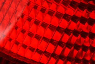
Red is the colour of blood. Blood equals life. Red is also the colour of passion and anger ( “seeing red” ), so red is associated with aliveness, vitality and strength. It’s a “primary” colour, a colour that is a PURE elementary colour. It’s engaging and emotive. It tends to excite people (“painting the town red”) and triggers the pituitary and adrenal glands, releasing adrenaline. It’s a great colour for restaurants as it stimulates appetite. It has high visibility. Red brings text and images to the foreground. Use it as an accent colour to stimulate people to make quick decisions; it’s a perfect colour for 'Buy Now' or 'Click Here' buttons on Internet banners and websites. In advertising, red is often used to evoke erotic feelings (red lips, red nails, red-light districts, 'Lady in Red', etc). Red is widely used to indicate danger (high voltage signs, traffic lights). This colour is also commonly associated with energy, so you can use it when promoting energy drinks, games, cars, items related to sports and high physical activity.

Orange (a fusion of yellow and red) denotes vibrancy, energy, fun, enthusiasm and exuberance. It’s no surprise then that Orange Telecom chose the colour and the name to appeal to a broad section of the general public. Orange can bring joy to our workday and even stimulate our appetite (for life and learning). Orange is the best emotional stimulant. It connects us to our senses and helps to remove inhibitions and makes us independent and social. Orange increases oxygen supply to the brain, produces an invigorating effect, and stimulates mental activity. It is highly accepted among young people. Orange would be good for a dance studio, a vitamin shop or food products to appeal to an audience seeking energy, warmth and even excitement.

Yellow represents the sun, springtime and brightness. It is the first colour the eye processes.
It is the most visible, which is why it gets the attention faster. Other key words associated with yellow include illumination, clarity, wisdom and self-esteem. Yellow gives us clarity of thought, increases awareness, and stimulates interest and curiosity (great for classrooms). Yellow energy is related to the ability to perceive and understand. The yellow energy connects us to our mental self, signifying communication, enlightenment and spirituality. Yellow is often associated with food. Bright, pure yellow is an attention getter, which is the reason taxis are painted this colour. Use it sparingly as too much use can be counter-productive. Tests have shown that people lose their temper and babies cry more in yellow rooms. Yellow is good for florists, schools, toy shops and sweet shops.
Personality Traits: Good-humoured, optimistic, confident, practical, and intellectual.
Companies using yellow in their logos include: The AA, Ferrari, Yellow Pages, Big Yellow, Caterpillar.

Companies that use green in their logo include: Lloyds TSB Bank, Starbucks, BP, grow, Prozac

Companies that use blue in their logo include IBM, Dell, Deutsche Bank and Pepsi.
Personality Traits: Loyal, tactful, incisive inspiring, inventive, cautious.
Purple combines the stability of blue and the energy of red. For some reason children love the colour purple (no, not the movie). According to surveys, almost 75 percent of pre-adolescent children prefer purple to all other colours. More individualistic, these colours convey imagination, intuition, wisdom and truth. Whether a blue tinge (mystery) or a reddish shade (sensual), these colours are great for elaborate and distinctive establishments including nightclubs, photographers, jewellers and restaurants.
Indigo personality traits: Intuitive, fearless, practical, idealistic, wise, and a truth seeker.

Violet is artistic and creative, sophisticated, luxurious and dignified. Through the blue tinge it is linked with royalty and therefore is great for luxury branding. It’s unusual and at the same time lavish and complex.
Black is a not a colour; it is the absence of colour. While it is associated with death (black plague, witches and evil), fear and the unknown (black holes) and negative connotations (black humour), it also suggests seriousness, boldness, power and formality (black tie).
It’s been used to communicate coolness, modernity, elegance and style. The fashion industry has adopted black wholesale as the experts say that it makes us look thinner, while designers wear black so as not to intrude with the colours they are demonstrating. What is for sure, is that no self-respecting lady would be without a little black “number”.

Each form of the seven colours of the rainbow: Red, Orange, Yellow, Green, Blue, Indigo, and Violet is connected to various areas of our body and will affect us differently emotionally, physically, and mentally. Each colour vibrates at its own individual frequency. In Colour Therapy, therapists believe colours contain energy vibrations with healing properties and that each colour corresponds to one of the seven chakras (energy centres in the body), which in turn can influence a specific gland, organ, or tissue of the body. Healers and therapists use colour to assist in healing and well-being.
So there is more to a colour than liking it or not. In design, practitioners spend years understanding the meaning and power of colour and how they relate to each other and how to use them together, from understanding that dark tones make objects look smaller while light tones do the reverse. Dark colours also lower stress and increase feelings of calm while bright colours spark energy and creativity and may increase nervousness and aggression.
Warm colours (red, orange and yellow) stimulate activity and excitement while cool colours (green blue violet) are more soothing and relaxing.
It’s important therefore to trust your designer with the use of colour, its degree of saturation (how much grey is there) and luminosity (how much white or intensity is there) and the hues (warm or cool) or depth (light or dark). Their experience is objective, based on a deep understanding of the power of colour and their uses and not based on the subjective “I like yellow!”. Colour should not be used simply for differentiation from competitors. You need to choose a colour that fits your brand message. Trust a designer who understands the theory of brands and the psychology of colour. It’s a science as well as an art.


No comments:
Post a Comment